
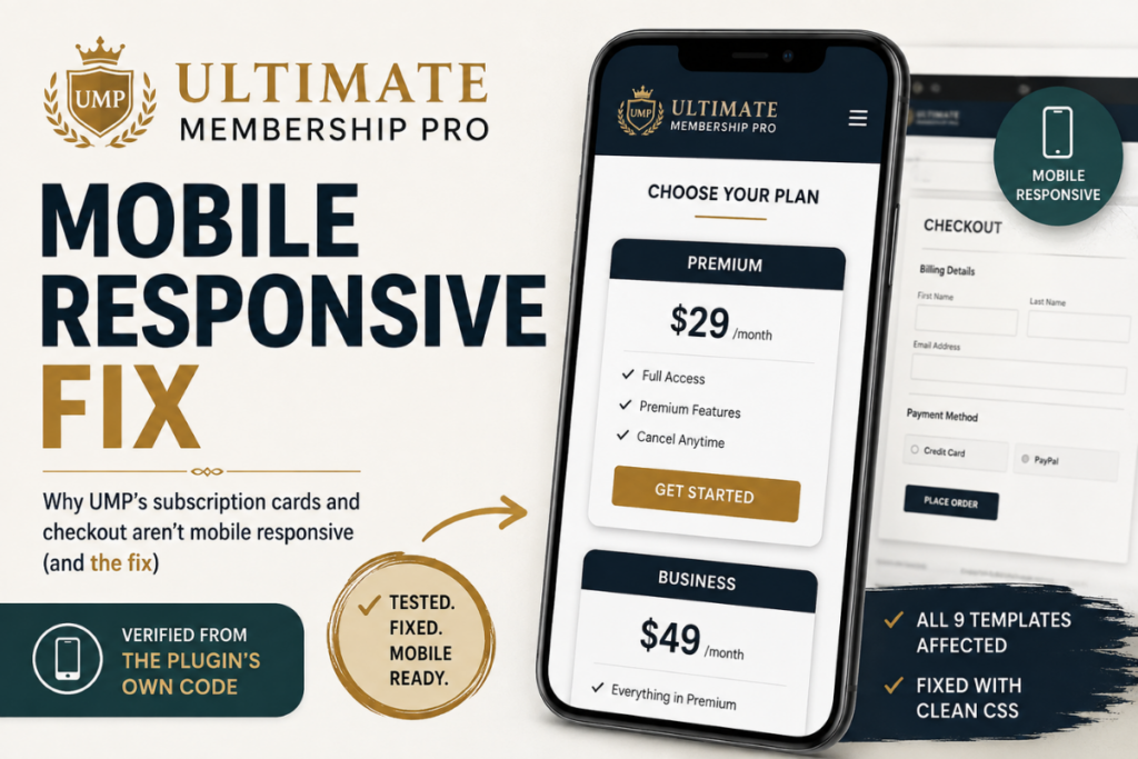
Ultimate Membership Pro Mobile Responsive Fix
If your Ultimate Membership Pro subscription plan cards look tiny and cramped on a phone, and your checkout page renders as two squeezed columns instead of stacking, you’re not misconfiguring anything. We pulled apart UMP’s own source code to confirm exactly what’s happening, and it’s not what you’d expect.
UMP is a solid plugin, and it’s what we run on our own subscription page. But two specific pieces of it were never built to be mobile responsive, and no setting in the dashboard fixes it, because the problem isn’t a setting. It’s in the CSS itself.
The subscription card bug
UMP ships 9 numbered card templates for your subscription plan page (Levels → Subscription Plan Template). Every single one of them sets the card’s actual sizing element to a fixed desktop percentage, with no mobile override anywhere:
.ihc_level_template_8 .ihc-level-item {
    width: 32%;
    max-width: 380px;
    min-width: 340px;
    display: inline-block;
}
That’s confirmed straight from UMP’s own assets/css/templates.css, not guessed from how it renders. On a desktop screen, 32% gives you a clean 3-column layout. On a phone, that same 32% is a genuinely tiny card, and there’s no @media query anywhere in the file that touches it.
It’s every template, not just one
We checked all 9. They all use the identical pattern, just with different percentages: 20% and 25% for the denser layouts, 32% for the standard 3-column ones, 50% for the 2-column option. If you switch templates hoping for a better mobile result, you can easily land on a narrower one and make it worse. There’s no “mobile-friendly” template hiding in the list. None of them account for phone screens at all.
The checkout page has the same bug
This one matters more, because it’s where money changes hands. UMP’s checkout page splits into two columns, the order summary and the payment form, using the exact same fixed-percentage pattern:
.ihc-checkout-page-left-side,
.ihc-checkout-page-right-side {
    display: inline-block;
    width: 49%;
    max-width: 600px;
}
UMP’s checkout stylesheet does have a mobile media query, so it’s not that they ignored mobile entirely on this page. It just never addresses these two specific elements. Everything else on checkout adjusts for phones; these two columns don’t, so checkout renders as two ~49%-wide squeezed columns on mobile instead of a clean, stacked, easy-to-complete form.
Worth knowing This isn’t a case of the developers doing something wrong. UMP genuinely does have mobile CSS for other parts of the plugin, a content locker, the account page, a transaction table. These two pieces just never got it. It’s a gap, not a mistake, but it’s a gap that shows up on literally every UMP site using the built-in showcase and checkout.
How we found it
Not by guessing. We went through UMP’s actual plugin files, assets/css/templates.css and assets/css/checkout.css, and traced the exact selectors controlling card and column width on every template. That’s also why the fix works regardless of which of the 9 templates you’re using: it targets the shared element every template has in common, not one template’s specific class name.
Frequently asked questions
Is Ultimate Membership Pro mobile responsive?
Partially. UMP has mobile CSS for several elements, including the account page and a transaction table. But its subscription plan cards, across all 9 numbered templates, and its two-column checkout layout have no mobile media query at all.
Why do UMP’s subscription cards look broken on mobile?
Every one of UMP’s 9 card templates sets the card’s real sizing element, .ihc-level-item, to a fixed desktop percentage (20% to 50%) using display:inline-block, with no mobile override anywhere in the plugin.
Does switching UMP’s card template fix the mobile issue?
No. All 9 numbered templates share the identical pattern, just with different fixed percentages. Some are narrower than others, so switching can make the mobile problem worse rather than better.
Get the fix
Pro members get our plugin that corrects both issues, the subscription cards and the checkout columns, across every UMP template. Install it, activate it, done. No CSS to paste, no settings to configure.